These types of graphs are great for comparing three components (things/factors) influence or strength.
Each component needs to be in a percentage. (out of 100)
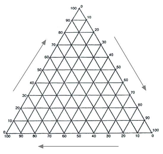
The position of the dot on the graph indicates which component (thing/factor) has the greatest influence or strength.

The graph above shows the employment structure in various different countries. (The percentage of people who work in Agriculture, Services and Industry).
In Myanmar the majority of the population work in Agriculture and less that 10 % work in Services and Industry.
In Malaysia 50% of the population work in Services, 23% in Industry, and the rest in Agriculture.
so...what is the percentages for the countries, the percentage for the agriculture, industries and services? I have had a hard time contemplating whether my answers were wrong or whether my answers were right. Thank you anyways! :) This was very helpful, I had a better look and clearer of the ternary diagram :)
ReplyDelete