Showing posts with label global patterns. Show all posts
Showing posts with label global patterns. Show all posts
Wednesday, March 25, 2015

Sunday, February 15, 2015
Yr13 - Some useful links to help you look at Birth Rate as a Global Pattern

Monday, January 26, 2015
Differences in Development - What do people have for school dinner around the globe?
What do students eat at school around the globe?
Below is a link to a good article about a photographer who took pictures comparing what the wealthy and poor eat in countries across the globe. Some of it is quite shocking.
Huffington Post Link
And...what does the world eat for breakfast?
Monday, September 8, 2014
Globalisation and Connectivity
This map shows every device (computer, laptop, smartphone etc) that was connected to the Internet on the 2nd of August this year. The article linked to below describes how an Internet Cartographer (map maker) created it.
From a geographers point of view it shows some great global patterns.
http://www.iflscience.com/technology/map-shows-all-devices-world-connected-internet

From a geographers point of view it shows some great global patterns.
http://www.iflscience.com/technology/map-shows-all-devices-world-connected-internet
Yr13 - A very low birth rate could cause major problems in Japan.
The article below describes some of the problems and some of the possible advantages of a very low birth rate in Japan.
This could be useful for you current Internal Assessment. Task 3 asks you to describe how Birth Rate can affect people globally.

http://thediplomat.com/2012/08/japans-demographic-nightmare/
This could be useful for you current Internal Assessment. Task 3 asks you to describe how Birth Rate can affect people globally.
http://thediplomat.com/2012/08/japans-demographic-nightmare/
Sunday, August 31, 2014
Sunday, August 17, 2014
Climate change is having big impacts now!
Some amazing pictures of the changing landscape today.
http://themetapicture.com/20-powerful-photos-that-show-the-severe-reality-of-climate-change-today/
Some people are actually having to relocate as the sea level rises.
http://www.scientificamerican.com/article/township-in-solomon-islands-is-1st-in-pacific-to-relocate-due-to-climate-change/

http://themetapicture.com/20-powerful-photos-that-show-the-severe-reality-of-climate-change-today/
Some people are actually having to relocate as the sea level rises.
http://www.scientificamerican.com/article/township-in-solomon-islands-is-1st-in-pacific-to-relocate-due-to-climate-change/
Thursday, August 14, 2014
Big Earthquakes double in 2014
It appears there have been more large earthquakes than normal this year! Although apparently it's nothing to worry about.
http://www.cbsnews.com/news/big-earthquakes-double-in-2014-but-scientists-say-theyre-not-linked/

http://www.cbsnews.com/news/big-earthquakes-double-in-2014-but-scientists-say-theyre-not-linked/
Monday, July 28, 2014
NZ ranks in the top ten of countries!
http://www.nzherald.co.nz/business/news/article.cfm?c_id=3&objectid=11300036&ref=NZH_FBpage
Article in NZ Herald describes how the latest Human Development report puts us a number 7!!
However this image still indicates that life in NZ isn't always fair!

Article in NZ Herald describes how the latest Human Development report puts us a number 7!!
However this image still indicates that life in NZ isn't always fair!
Wednesday, July 23, 2014

Yr12 - Climate Change and Global Warming
Great article on just how much our climate is changing.

All the areas that appear to be a dark blue have far more water in the atmosphere than normal. This is caused by the area being warmer than normal.
The article below explains this in more detail.
Link to article from climate news
All the areas that appear to be a dark blue have far more water in the atmosphere than normal. This is caused by the area being warmer than normal.
The article below explains this in more detail.
Link to article from climate news
Geography in the News.
Some very "interesting" things have happened in the world over the last few weeks and all are relevant or have links to geography.
The map below from CNN gives you an idea why the current events in the Ukraine and Russia are so complex.

Link to CNN article
The map below from CNN gives you an idea why the current events in the Ukraine and Russia are so complex.
Link to CNN article
Yr12 - Fossil Fuels and Global Warming
Fossil fuels and global warming from lavenderbongo
The above slideshow is from the last lesson and has some useful links in it to videos explaining Global Warming in more detail.
The above slideshow is from the last lesson and has some useful links in it to videos explaining Global Warming in more detail.
Thursday, July 3, 2014
New Zealand graded as a "Good" Country

I always thought New Zealand was a great place to live and here apparently is the proof!
An article in a British newspaper has ranked all the countries in the world according to various factors which can be used to judge whether a country is a "good" place to live or not.
We currently come in at number 5 in the world!
Do you agree with this surveys findings?
Original article here
:) Have a good holiday

Just how do 32 teams from 32 different countries communicate during the world cup?
Here is a link to an interesting article explaining how they do.
Communication during the world cup

Here is also a great article by Oxfam looking at inequality between the development of different countries in the world cup.
Oxfam World Cup Inequality
Wednesday, June 25, 2014
Refugee crisis in Europe

People running from poverty, political and religious persecution are causing huge problems for the countries of southern Europe.
The article linked to below has some great photos and descriptions of the conditions and risks people are willing to take when they are in search of a better life.
Article in the Guardian on Refugee crisis
Tuesday, June 17, 2014
Thursday, June 12, 2014
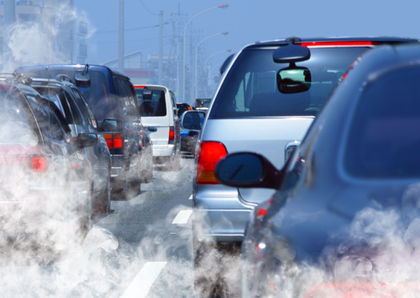
Where in the world has the worst air pollution?
A great interactive map showing where in the world has the worst air pollution. Could be very useful for the internal assessment on global patterns at Level 3.

The growing impact of Global Warming
The great article below describes how global warming is affecting the lives of people living in Alaska. Their beliefs, way of life and traditions are being threatened.

Article in the Atlantic
Article in the Atlantic
Thursday, May 29, 2014
World on the brink of another great Extinction.
A very depressing article on the current rapid rate of extinction. Human actions are causing more and more animals and plants to disappear forever from our planet.
Apparently there is hope though.
Link to article in Huffington Post.
Could be useful for looking at global patterns or issues.

Apparently there is hope though.
Link to article in Huffington Post.
Could be useful for looking at global patterns or issues.
Subscribe to:
Posts (Atom)